Market timing is crucial for active investors due to two primary reasons. Firstly, the recent surge in the market presents the challenge of resisting the temptation to enter at inflated prices and potentially suffer losses during ordinary market pullbacks. Secondly, when riding a trend successfully, it is imperative to avoid overconfidence. Markets can be unpredictable and reverse suddenly, punishing overconfident investors. Patience and disciplined decision-making are key in such scenarios. To prevent over-committing to a possibly unsustainable trend, it is essential to stay vigilant, periodically reassess risks, and have exit strategies in place. Relying on data and historical trends is far better than gut feelings or anecdotal evidence alone. Here are eleven charts that point to the current rally’s potential unsustainability in the short term:
Chart #1: Downside Volume Near Record High Signals Warning Shot
A 90% downside volume day in the market signifies a day where 90% or more of the total trading volume is concentrated in stocks red for the session, indicating a substantial and broad-based sell-off. On Tuesday, Mark Ungewitter observed that the NYSE suffered a 90% downside day within 3 sessions of recording a record high. Such a signal is rare, but it has marked significant market tops the past four times it has occurred.
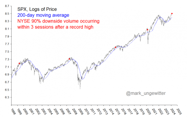
Image Source: SenimenTrader
Chart #2: Rate Cut Odds Plummet
A few months back, the market was pricing in a March interest rate cut. However, after Tuesday’s hotter-than-anticipated CPI reading, the CME FedWatch Tool is now pricing in a ~90% chance rates will remain unchanged in March.
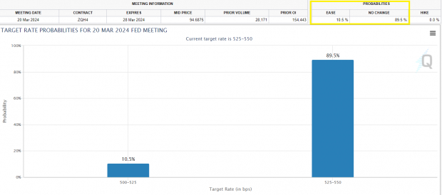
Image Source: Chicago Mercantile Exchange
Chart #3: Presidential Election Seasonality
Presidential election seasonality refers to the observed patterns and trends in stock prices during the lead-up to and aftermath of a presidential election. Historically, in a presidential election year, stocks retreat from February to March before gaining bullish momentum into year-end. Stocks are entering their historically weakest period of an election year now:
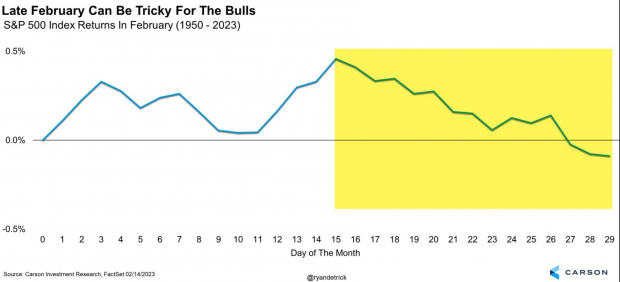
Image Source: Ryan Detrick, Carson Investment Research, FactSet
Chart #4: CNN Fear & Greed Index
The CNN Fear & Greed index combines various factors, including market volatility, breadth, put and call options, and other indicators, to generate a single composite score on a scale of 0 to 100. Over the past few years, fading sentiment extremes in the indicators have bode well for investors. The Fear & Greed Index currently sports an “Extreme Greed” reading.
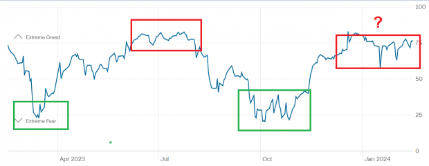
Image Source: CNN
Chart #5: NASI Flashes “Bear” Signal
The McClellan Oscillator is a market breadth indicator designed to analyze the advancing and declining issues in the stock market. The faster moving average recently crossed below the slower moving average, signaling a bear cross. Historically, there are very few signals, but when there is one, they tend to be meaningful.
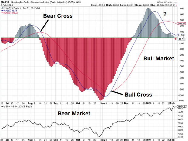
Image Source: StockCharts.com
Chart #6: Volatility Seasonality
Over the next month, the Volatility Index (VIX) has historically averaged a sharp rise. After such a bullish trend in equities, a pick-up in volatility would not be surprising and would shake out “weak hands.”
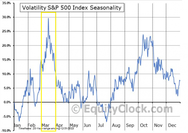
Image Source: Equity Clock
Chart #7: “Hindenburg Omen” Signal Flashes
SentimentTrader identified a rare Nasdaq “Hindenburg Omen” signal. The signal, created based on historical work by researchers, monitors specific conditions that signify potential underlying market weakness. Multiple signals in a cluster are a worrying sign. Traditionally, the signal is canceled after 30 days or if the Oscillator turns positive again, though it can lead to market trouble several months in advance.

The Bear Case: Uncovering Hidden Market Signals
Image Source: SentimenTrader
A Bullish Treasury Yield With Bearish Implications
A bullish treasury yield can be bearish for stocks due to its impact on borrowing costs and investor preferences. When treasury yields rise, it typically leads to higher interest rates across the financial system. Higher interest rates can increase borrowing costs for companies, potentially affecting their profitability and slowing down economic activity. The CBOE 10 YR Treasury Note Yield (TNX) recently broke out above its 50-day moving average:
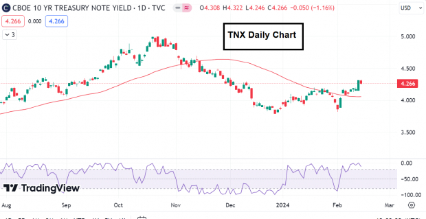
Image Source: TradingView
Is the NH-NL Momentum Swing Signaling Trouble?
NH-NL measures the net new highs in the NYSE versus net new lows. Ian McMillan of Adapitv (@the_chart_life on X) pointed out the “NH-NL (common stock only) went from a YTD high reading on Monday 2/12, to a net-negative reading on Tuesday 2/13.” Bull markets need net new highs to continue for a sustained bull market. Are we seeing cracks here?
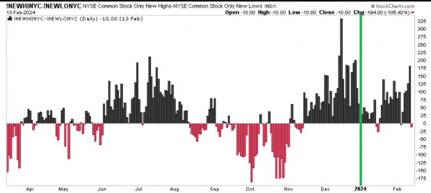
Image Source: StockCharts.com
Active Investors Reach Maximum Exposure
The NAAIM Exposure Index, which represents the average exposure to U.S. Equity markets reported by the National Association of Active Investment Managers, remains stubbornly high at 93% exposure. In July 2023, NAAIM reached over 100% exposure, leading to a multi-month pullback in equities. Will history repeat itself?
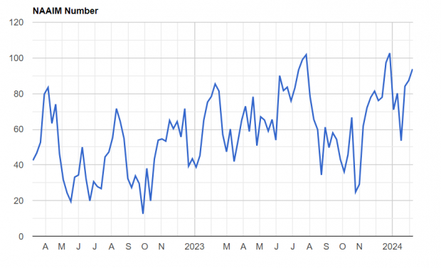
Image Source: NAAIM
Market Leader Flashes Frothy Signal
The leaders of the day are often the best way to know where the market will go next. Years ago, the saying was,“So goes General Motors (GM), so goes the market.” Though the leaders have changed over the years, the sentiment remains unchanged. AI-related stocks such as Nvidia (NVDA), Microsoft (MSFT) and Super Micro Computer (SMCI) are the new true market leaders.SMCI is up some 846% over the past year. The stock is nearly 200% above its 200-day moving average – an extreme level. While such an extension does not necessarily mark an imminent top, stocks historically have a difficult time holding 200% or more above the 200-day.
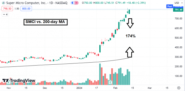
Image Source: TradingView
Considering Both Sides of the Market
Anyone who has read my work over the past year knows I have been bullish. Though price remains firmly in an uptrend, I believe it is a valuable exercise to look at both sides of the market and keep an open mind. While I am not necessarily bearish, the risk-to-reward for bulls is simply not as favorable as it was back in October.
Zacks Names “Single Best Pick to Double”
From thousands of stocks, 5 Zacks experts each have chosen their favorite to skyrocket +100% or more in months to come. From those 5, Director of Research Sheraz Mian hand-picks one to have the most explosive upside of all.
It’s credited with a “watershed medical breakthrough” and is developing a bustling pipeline of other projects that could make a world of difference for patients suffering from diseases involving the liver, lungs, and blood. This is a timely investment that you can catch while it emerges from its bear market lows.
It could rival or surpass other recent Stocks Set to Double like Boston Beer Company which shot up +143.0% in little more than 9 months and NVIDIA which boomed +175.9% in one year.
Free: See Our Top Stock And 4 Runners Up
Microsoft Corporation (MSFT) : Free Stock Analysis Report
CME Group Inc. (CME) : Free Stock Analysis Report
NVIDIA Corporation (NVDA) : Free Stock Analysis Report
General Motors Company (GM) : Free Stock Analysis Report
Super Micro Computer, Inc. (SMCI) : Free Stock Analysis Report
To read this article on Zacks.com click here.
The views and opinions expressed herein are the views and opinions of the author and do not necessarily reflect those of Nasdaq, Inc.